Flexbox Lesson #6
Add Three Columns to the Footer
In this lesson we'll add our 3 column footer.
Sixth Exercise
Copy and Paste the code in red into the footer element.
<footer>

<div class="ftr-left">
<p>Left</p>
</div>
<div class="ftr-middle">
<p>Middle</p>
</div>
<div class="ftr-right">
<p>Right</p>
</div>

</footer>>
🔴 Save flex-tutorial.html
Copy and Paste the Css below the last entry in the style sheet.
footer { /*Begin nested footer*/
justify-content : center;

gap : 1dvw;
background-color : #000;
color: #fff;

div.ftr-left {
flex: 1;
p { /*nested paragraph*/
tex-align: left;
}
border: solid 3px #ff0;
}

div.ftr-middle {
flex: 3; /*width 3 times default*/
p { /*nested paragraph*/
text-align :center;
}
border: solid 2px #0ff;
}

div.ftr-right {
flex: 1;
p { /*nested paragraph*/
text-align : right;
}
border: solid 1px;
}
} /*End nested footer*/
🔴 Save flex-tutorial.html
👀 Look at the page with your browser.
The Result
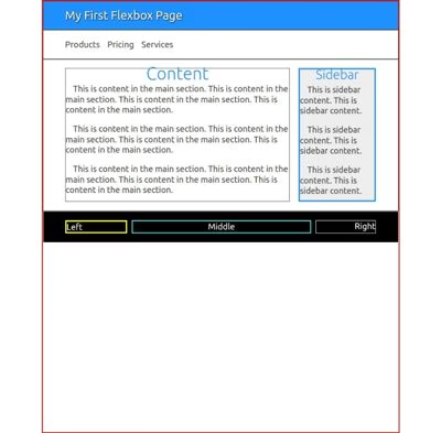
You should see the black footer with 3 columns and once again the ugly borders to help us see the size adjustments and the gap between columns.
If this is what you see, you're ready to finish the web page.
Explanation
- justify-content : center;
- gap : 1dvw;
These 2 lines of CSS are self explanatory. Center the 3 columns with even spacing of 1% of the viewport width between them.
The 3 columns can be used for site navigation (left and right) or as conventional footers today as a collection of links to other pages and resources.
They are all child containers and are pretty much the same except for text alignment.
flex: 3; /*width 3 times default*/
This line of CSS tells the browser to make the middle column 3 times the size of the default width.