🛠Web Developers Emulator Tool
How to Find and Use It
When building web pages using Responsive design techniques, one of the handiest tools you'll come across is the Web Developers Emulator Tool.
It makes it possible for you to simulate viewing your web pages on various different size devices, from 320 pixels to desk top widths.
Guess what? You don't need to buy it or download it because most all browsers already have it installed.
This tutorial will show you how to find it, turn it on and give a couple of tips about using it.
Just a word: I am running on Linux, but I believe the process will be the same on Windows. If it isn't I'd appreciate a heads up from someone. Here we go!!
I tested 6 different browsers and only one (Firefox /Linux) didn't open Developer Tools by pressing CTRL Shift J
On Firefox/Linux you have to find the 3 bars top right hand corner, click them, choose More Tools, then Responsive Design Mode.
You can use the emulator online after uploading your web pages but it's best to use it offline before publishing.
Let's get started:
Open your web page in the browser you use off line
Set it to full view
Press Ctrl Shift j or F12
Web Developer tools will open usually in a right hand sidebar
How to find the Emulator
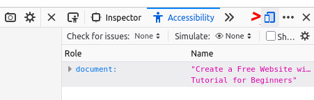
I've made a screenshot of each of the 6 browsers which shows the top of the Developer Tools Sidebar. The little red caret on each pic shows the location of the Emulator Tool icon. Just click it to open the emulator.
Firefox/Linux
For just the emulator use Responsive Design Mode as shown above.
Google Chrome/Linux

Chromium/Linux

Opera/Linux
MS Edge/Linux

Brave/Linux
The Emulator
The Emulator Tool will open at the top of your web page. It's very close to identical in appearance for all browsers.Except of course Firefox
From left to right:
Dimensions: name of device
drop down arrow that gives choice of device to emulate
actual dimensions of the device
Next you'll see a relative value (percentage) and another drop down arrow.(Not Firefox)
The emulator will choose that value for you first time thru. Could be 25%, 50%, etc.
I work on a desk top so I change it to 100% and view web pages at the actual width of the device.
Which ever width you choose, leave the Auto-adjust Zoom at the bottom checked. If you turn it off the emulator will cut off the bottom of your pages.
Using the emulator will allow you to see how well your page will perform in the smaller devices.
If you need to make adjustments to text size, margins and padding you'll see it here.
You'll also be able to see if you've coded your media queries and images properly.
Hope this helps in your web page building projects and responsive design endeavors.