How to Create a Web Page
New Semantic HTML
We use three new tags or box elements added in HTML5: <header></header>, <nav></nav> and <footer></footer>
We're using these new box elements with the main element to build a Semantic web page.
Once again Semantic just means we're using box elements created for a specific purpose, recognized by their name.
Among other advantages it makes the web page easier to navigate for users with disabilities.
Second Exercise
Note: Need more space to work? You can create extra space in the code at any time by simply placing the cursor after a closing bracket ( }| or >| ) in either the CSS or HTML code and pressing the Enter key a couple of times.You can always remove it later on.
Copy and Paste this code into the HTML Body section below the <body> tag:
<header>

</header>
<nav>

</nav>

<main>

</main>
<footer>

</footer>
Define the Structure
Now we need to add the code to our style sheet to define the settings for our head, main and footer divisions.
The code will be the same for each except for the color settings.
Copy and Paste this code into the style sheet below the closing bracket for the definition of the body section:
header{
	padding: 2dvw clamp(1.5rem , 1.5rem + 9dvw , 10dvw);
	background:linear-gradient(to bottom , dodgerblue , whitesmoke );
	}

nav{
	background-color: dodgerblue;
	padding: .25rem clamp(1.5rem , 1.5rem + 9dvw , 10dvw);
	box-shadow: 2px 2px 4px #000}

main {
 	padding: 0 clamp(1.5rem , 1.5rem + 9dvw , 10dvw);
	}

footer {
	padding: 1dvw clamp(1.5rem , 1.5rem + 9dvw , 10dvw);
	background-color:dodgerblue;
	border: solid 1px;
	box-shadow: 6px 6px 10px #000;
	margin-bottom : 1dvw
	}
🔴 Save myfirstpage.html
👀 Once you get everything added to the style sheet and saved, look at the HTML page with a browser or Preview function of HTML Editor. Refresh or reload if the page is already open.
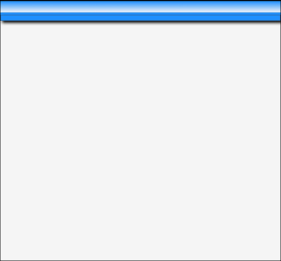
The Result
Just 3 blue lines at the top.
👉
Test Your Comprehension
💡Take a quiz on the information presented so far.
Ready to Proceed
When you get everything working with the desired result in your browser, you are ready to proceed to the next exercise. Don't go on unless you have a basic understanding of the procedures presented so far.
Don't be afraid to delete all your work and start over from the beginning!
What's Ahead
In the next lesson we're going to add some text to our header element. Go to Next Lesson
More Helps
If the information on the Clamp Function is confusing, you might want to take a time out and study the simple Tutorial we provide. Clamp Tutor
Need something more advanced. Check out our Web Development Resources page for some more advanced tutorials and reference guides for HTML5, CSS3, Responsive Design and SEO.