How to Create a Web Page
📖 Add More Content
You should complete these lessons in order.
If you haven't completed the first 4 exercises, go back and start at the beginning.
Adding paragraphs
Our next step is to add a little content to the main division.
To the main division, we'll add 8 paragraphs of sample using the paragraph tag. ( <p></p>)
Fifth Exercise
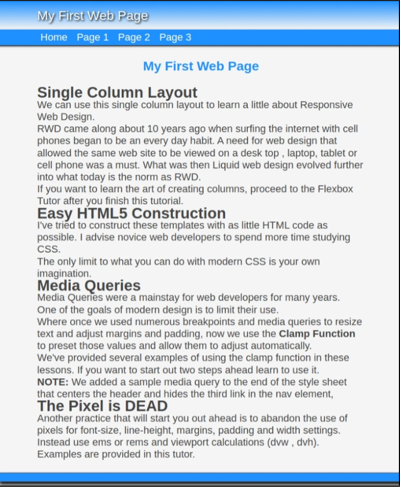
Copy and Paste the code shown in drk red inside of the main division below the H1 tag as shown:
<main>
<h1>Responsive Web Design</h1>
<h2>Single Column Layout</h2>
<p>We can use this single column layout to learn a little about Responsive Web Design.</p>
<p>RWD came along about 10 years ago when surfing the internet with cell phones began to be an every day habit. A need for web design that allowed the same web site to be viewed on a desk top , laptop, tablet or cell phone was a must. What was then Liquid web design evolved further into what today is the norm as RWD.</p>
<p>If you want to learn the art of creating columns, proceed to the Flexbox Tutor after you finish this tutorial.</p>
<h2>Easy HTML5 Construction</h2>
<p>I've tried to construct these templates with as little HTML code as possible. I advise novice web developers to spend more time studying CSS. </p>
<p>The only limit to what you can do with modern CSS is your own imagination.</p>
<h2>Media Queries</h2>
<p>Media Queries were a mainstay for web developers for many years.</p>
<p>One of the goals of modern design is to limit their use. </p>
<p>Where once we used numerous breakpoints and media queries to resize text and adjust margins and padding, now we use the <b>Clamp Function</b> to preset those values and allow them to adjust automatically.</p>
<p>We've provided several examples of using the clamp function in these lessons. If you want to start out two steps ahead learn to use it.</p>
<p><b>NOTE:</b> We added a sample media query to the end of the style sheet that centers the header and hides the third link in the nav element,</p>
<h2>The Pixel is DEAD</h2>
<p>Another practice that will start you out ahead is to abandon the use of pixels for font-size, line-height, margins, padding and width settings.<p>
<p>Instead use ems or rems and viewport calculations (dvw , dvh). Examples are provided in this tutor.</p>
<p class="spacer"> </p>
🔴 Save myfirstpage.html
👀 Refresh and Preview
Defining Appearance of New Paragraphs with CSS
We've already covered the formating of h1 heading tag. Now we'll format our h2 headings and paragraphs.
Copy and paste the code into your style sheet below the last entry.
Explanation below:
main h2 {
   /*20px to 24px */
	font-size: clamp(1.25rem , 1.25rem + .25dvw  ,1.5rem );
	line-height : clamp( 1.5rem , 1.5rem + .25dvw  , 1.8rem );
	text-align:center;
	color:dodgerblue;
	}

main p {
	text-align:left;
	text-indent:1rem;
	margin:1dvw 0}

main p.spacer {
	display: block;
	font-size : 2rem;
	clear: both
	}
🔴 Save myfirstpage.html
👀 Refresh and Preview

👉
Finish the Footer
Copy and Paste your footer information to the footer element using the paragraph tag as shown.
<footer>
<p>© 2025 - My First Web Page - All Rights Reserved</p>
</footer>
🔴 Save myfirstpage.html
Copy and Paste into the style sheet:
footer p {
	color: #fff;
	text-align: center;
	padding: 1dvw 0
	}
🔴 Save myfirstpage.html
👀 Refresh and Preview
The Result
If this is what you see, you are ready to continue:
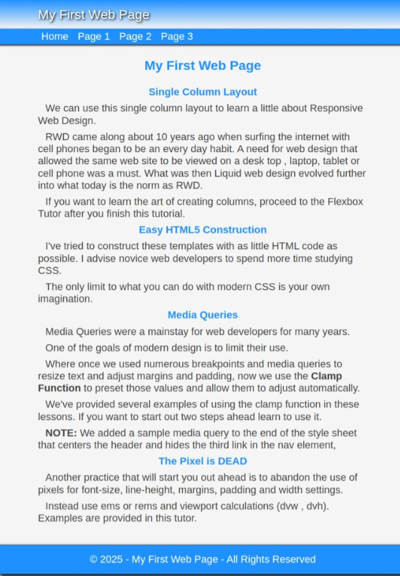
Were you successful? If you were, congratulations!!
If not, check the code that you added to your HTML page and style sheet.
What's Next
We'll be adding an image, a top button and a new page and linking to it.
Need something more advanced. Check out our Web Development Resources page for some more advanced tutorials and reference guides for HTML5, CSS3, Responsive Design and SEO.