Box Shadow - CSS3
The box shadow property is one of those CSS techniques that has been experimental for some of the last releases of CSS.
It is now supported by the latest versions of all major browsers.
When used properly it adds a nice raised almost 3 dimensional appearance to images, divisons, tables and many other web page elements.
If used too much it can be a little monotonous.
Experiment, experiment, experiment!!
Overuse of Box Shadow will slow your web pages. Be SMART!!
The CSS
box-shadow: 5px 5px 10px #000

h-shadow Required. The position of the horizontal shadow. Accepts Negative values.
v-shadow Required. The position of the vertical shadow. Accepts Negative values.
blur Optional. The blur distance
color Optional. The color of the shadow.
spread Optional
inset Optional
Examples of Box Shadow
Since we use it on this page, you might look around and see the different places we use it. I know we overdo it a little, but once you find out how easy it is to add, you'll probably do the same for a while.
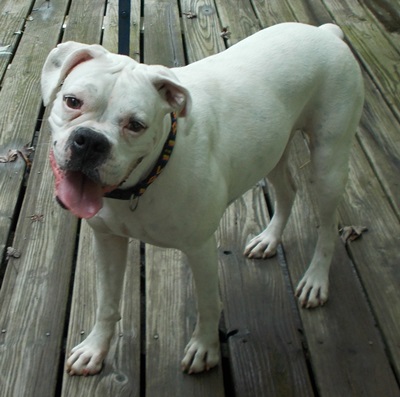
Use it on pictures.
With
Without
HTML
<img src="images/chelsie-400.jpg" alt="chelsie">
CSS
max-width:100%;
margin: 0 auto;
box-shadow: 2px 2px 8px #000;
Using Hover
We use box-shadow on our code examples like those shown here. We use the pre selector but we add the box-shadow on hover.
pre {box-shadow: none}
pre:hover {box-shadow: 2px 2px 4px #444 }
Inset
box-shadow: 5px 5px 10px #444 inset
Works well with most box elements.
Difficult to use with images, because it displays behind.
Buttons on the Fly?
The CSS which we used to enhance a simple h5 element:
width: 85%;
margin: 0 auto;
color: #fff;
background: orange;
text-align: center;
box-shadow: -10px -10px 2rem #000 inset;
border-radius: 2rem;
padding: 1rem;
Note the use of negative values.
Orange Tube Anyone?