Flexbox Lesson #4
In this lesson we'll add content to the nav element.
Its flex settings were already defined in the second lesson.
We use an unordered list for adding our links. You would of course replace the items with anchor tags.
Fourth Exercise
Copy and Paste the code in red inside the nav element
<nav>


<ul>
<li>Products</li>
<li>Pricing</li>
<li>Services</li>
</ul>


</nav>
🔴 Save flex-tutorial.html
Copy and Paste the CSS below the last entry in the style sheet.
nav { /*begin nested nav*/
     justify-content: flex-start;
     align-items : flex-start;

      ul {
      display: flex; /* Enables Flexbox */
      /* Remove bullet points */
      list-style: none;
      padding: 0; /* Removes default padding */
      margin: 0; /* Removes default margin */
         }

         li {
             /* Adds spacing right side only */
             margin: 0 1rem 0 0;
             }
     } /*End nested nav*/
🔴 Save flex-tutorial.html
👀 Once you get everything added to the style sheet and saved, look at the HTML page with a browser or Preview function of HTML Editor. Refresh or reload if the page is already open.
The Result
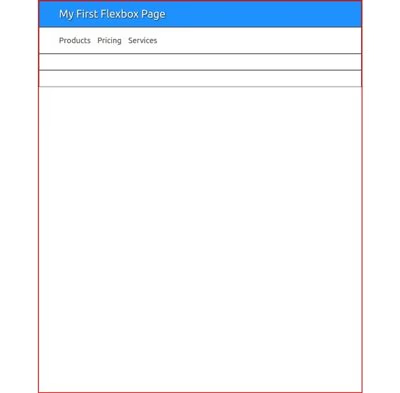
You should see something similar to this image. It may vary depending on whether you chose to keep the full viewport width or changed to a max-width setting.
Explanation
These 2 lines align the content of the nav element to the left:
justify-content: flex-start;
align-items : flex-start;
NOTE: The use of flexbox for the nav element could be considered over-kill. You could just use conventional CSS for its styling. It's fine to mix flexbox and plain ole CSS on the same page.
If you were to plug in one of our horizontal drop downs, you would need to convert nav to conventional CSS. Just remember to preserve the same margins and padding.