Flexbox Lesson #7
Adding a Media Query
Because we used the clamp function to preset font-size, line-height, margins and padding we signicantly reduced the need for media queries.
We'll add just one media query to rearrange the design for viewing on smaller devices.
Seventh Exercise
Copy and Paste this code into the style sheet below the last entry.
@media (max-width: 820px) {
/* Force columns to wrap */
main div.left , main div.right {
flex : 100%}

header {
/* Change flex-direction to column */
flex-direction : column;
justify-content: center; /* center content */
align-items: center /*center items */
}

}
🔴 Save flex-tutorial.html
👀 Look at the HTML page with your browser .
Squeeze to about 800 pixels wide.
The Result
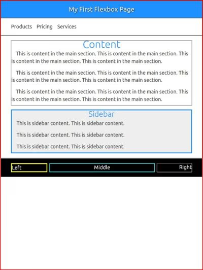
This is the finished page ready to be viewed on any devise. Of course you need to remove the ugly borders.
Explanation
flex : 100% changes the width of the columns in the main element and the flex-wrap : wrap function added at the beginning causes them to stack on top of each other.
header {
/* Change flex-direction to column */
flex-direction : column;
/* center content */
justify-content: center;
align-items: center /*center items */
}
These 3 lines of CSS change flex-direction for the header from the default row to column.
The next 2 lines center the paragraph tag in the header.
What Now
This is about as basic Flexbox as you'll find. Play with it. Practice placing images in the child containers. Experiment with column widths.
When you think you have a basic understanding of Flexbox, the clamp function and nesting in CSS, you're on your way to learning the more confusing stuff.
More Helps...
Flexbox Templates
We're in the process of converting all our Free Templates to Flexbox.
Our templates are actually teaching tools. They include working examples of flexbox, proper use of the clamp function, drop down menus, top and back buttons, dark mode toggle and nesting in style sheets.
Download and dissect or use them to build a website.