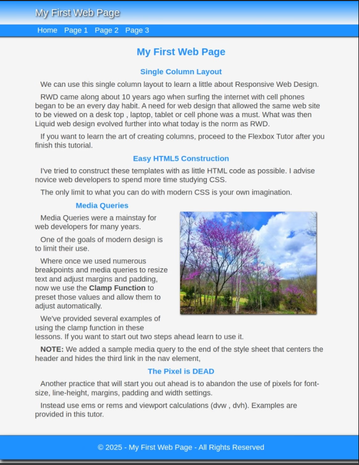
CreateaFreeWebsite

 with Responsive Web Design

Create a Website with Responsive Web Design

The future of web development is in Responsive Web Design

That simply means building one website that can be accessed with any device: desktop, laptop, tablet, cell phone and anything in between.

As Promised Easy Flexbox
It's copy and paste. Flexbox can be as confusing as you want to make it. Start simple with these working examples.

Easy Flexbox tutorial is coming. Completing some of the 9 step tutorial can give you an understanding of the basics and a better appreciation of the NEW methods.

Seeing + Doing = Learning

That's our philosophy on teaching and the approach we use in our tutorials. You'll See the HTML Code, Preview it in a browser, add the CSS to define its appearance and Preview again in a browser. You'll actually See firsthand what the CSS does. It's all Copy and Paste

We offer a 9 Step Tutorial where you'll create very simple responsive web pages with reponsive columns and images.

The tutorial will also show you how to build a Drop Down Menu. It will introduce you to the W3C Validator for checking your code and the Web Developer's Emulator Tool where you can simulate testing your pages in various different size devices.


506 Template Kit

We'll also introduce you to the cornerstone of Responsive Design, the Media Query. We'll show you how to use Web Developer tools to estimate break points and how to use those Media Queries at those break points.

Whether you plan to Build a Website Yourself, are thinking about a career in Web Development or just want a better understanding of the process, you can get started right by spending a few minutes with us.

You'll see how responsive web pages are built by first SEEING and then DOING just that.

Your finished web page will be Mobile Ready with Responsive Web Design features.

Start the 9 Step Tutor NOW!

Note: The information presented here is entry level for beginners. Get grounded in the BASICS early and it will be easier when you realize the magnitude of what CSS has brought to the web development industry.

Free 5 Page Responsive Web Design Kits

Once through the tutor, grab one of our free 5 page Responsive Web Design Template Kits 500 Series and experience a mini tutorial on making images responsive and creating responsive columns.


Our Purpose

The purpose of this website is to help beginners in the field of web development to get grounded in the Basic Fundamentals of HTML5 and CSS.

If you have a basic understanding of the process involved in building web pages, you'll be better prepared to invest your time in learning the more modern techniques of Flexbox and CSS Grid for flexible and efficient layouts.

Knowing the basics of CSS will prepare you to leverage frameworks like Bootstrap or Tailwind CSS for pre-designed components and responsive grids to speed up development and ensure consistency across the site.

Let me help you to build a solid HTML foundation, then enhance with CSS and a SMIDGE of JavaScript for advanced features.

Yes, I'm old school, but I still get tickled pink every time someone tells me I got them started down the Road to Responsive Web Design

Create a Free Website?

If you've visited the SERPS for that search phrase you realize what a joke it is. Yes, they are all FREE. Sure they are.

How are we different?

We actually teach you to code your own web pages right on your desk top, lap top or tablet. Then you have the option of publishing with us or whoever else you choose.

SO, who's really FREE?

Count the ads you find on this site. Compare that to their sites.

We're Teaching. They're Selling.

501 Template Kit

The Road to Responsive Web Design

Our newest template kits 500 Series aren't just templates. They're mini tutorials on making images responsive, creating multiple responsive columns and using Media Queries.

They include a choice of 6 different horizontal and vertical menu systems from our navbar collection and the new Toggle Menu that kicks in for smaller devices.

The kits include 5 web pages with various column designs, 3 style sheets and the lmenu.html page.

Test Drive Template Kit #501
Download Template Kit #501

It comes ready to perform on a full size desk top or cellphone. Download it and run it through the Web Developers Emulator tool.

Or you can test drive the entire 500 Series collection.


9 Step Tutorial (Using a Text Editor - Copy and Paste)

Beginners are encouraged to work through the 9 Step tutorial several times. You'll be surprised at how much of the information sinks in about the third time through just by copying and pasting.


Our Tutorial Process

Beginners will start with a simple approach to learning: Seeing + Doing = Learning

You will SEE HTML5 code:

<html>
<body>
<p>Paragraph code</p>
</body>
</html>

You will copy it and paste it into a web page you created.

You will SEE CSS code:

p {
  font-family: arial, tahoma, serif;
  font-size: 1rem
}

You will copy it and paste it into a style sheet you created.

Then you will learn to look at the HTML document with a browser and see how HTML and CSS work together.


What's New?

Please Be Patient. EASY FLEXBOX Tutorial Is COMIN

Updated Button Gallery: Create buttons with HTML/CSS. Now includes the Top button, The Up Button, the Go Back button, Popups and Popovers. A couple use just a smidge of javascript. Visit the Gallery

Scrolling Columns: If you want an easy answer to the question: "How do you hide ugly scrollbars and still allow scrolling on a web page?", our newest template kit provides the answer in a working example.
You can Test Drive Template Kit #601 or
Download : Template Kit 601.zip

Just for FUN: 😁 🐕 📫 ✍ ✔ WingDings, Webdings and Such

A fairly NEW NAVBAR collection. They include horizontal and vertical designs. Demos are provided for each and if you can use them you can download them in zip kits. I just rebuilt our navigation device on this website using the vertical float right display left design. Go to Navbars

Fairly new Tutorials. Check out How to Use the W3C Validator and How to Find and Use the WebDev Emulator Tool. If you're serious about learning to build websites you should check out both of them.
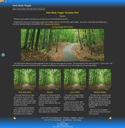
Let Me Give you the FINGER 🖕

📌I've had a couple of complaints that certain template kits don't include the FINGER navigation bar. Laziness on my part. So let me post the code and you can copy and paste at your leisure.

The HTML

This code will duplicate the FINGER navigation bar on the bottom of this web page.


<footer>
<p class="footernav">
<a class="ftr-left" href="page.html" title="Where it's goin.">&#128072;</a>
<a class="ftr-right" href="page.html" title="Where it's goin.">&#128073;</a></p>
</footer>


🙄


The CSS

footer{
width:96%;
background:linear-gradient(to top , #0066cc, #fff);
float:left;
padding: 0 2% 2% 2%;
}

/*Footer Navigation*/

p.footernav {
text-indent: 0px
}

p.footernav a {
text-decoration: none;
font-size : 50px;
text-shadow: 1px 1px 1px #000
}

.ftr-left {
float: left
}

.ftr-right {
float:right
}

This site will teach beginners the fundamentals you need to create a responsive website with HTML5.

We Focus On

Using as little HTML code as possible. Learning a lot of CSS

When you're ready to go online grab the same web hosting we use, get a free domain name and host it for as little as $3.99 a month.


Planning Your Website

🛑Before you begin the actual construction of your website, you should visit our Website Design Tutorial .


The Traveling Top Button

One of the trends in web design today is to make one long scrolling page. You've been there where you get half way down on mobile and it takes 3 hard swipes to get back to the top.

👉You can solve that problem with a sticky header or a sticky top button.


Very Basic HTML

<p><a href="#heading" class="top-button">Top</a></p>

Specify the location you want to jump to like so:

<header id="heading">


💡 Time Out for a teaching Moment

In CSS, the !important declaration is used to give a specific style rule the highest priority, overriding any other conflicting rules, regardless of specificity or source order. It ensures that the style is applied no matter what.(From Copilot)

We use it in the CSS on the right (once again because I'm LAZY) to override the settings for the anchor tags in the main division.


🙄


The CSS


p a.top-button {
/*Button*/
position: fixed; /*Make it Sticky*/
bottom: 2rem;
right: 1.5rem;
width: 2rem;
height: 1.75rem;
padding: .75rem ;
background: #0066cc;
border: solid 4px #ffff00;
border-radius: 50%;
box-shadow: 1px 1px 4px #000;
/*Button Text*/
font-family: arial, serif;
color: #fff !important;
font-size: 1rem;
font-weight: bold;
text-decoration: none;
text-indent:0;
text-shadow : 1px 1px 2px #000;
}


p a:hover.top-button {
color: #000 !important;
background-color: #fff;
box-shadow: 1px 1px 4px #000 inset !important;
text-shadow:none;
border: solid 1px #000;
}

Free Tools and Resources

Need more advanced info? Check out our WebDev Information page for some really great tutorials and resources for HTML5, CSS3, Responsive Design and SEO.


ThingsThingsHave you found Thiings yet?.
Over 6000 Free 3D images that you can download (individually or the complete set) and use for personal or commercial projects. You have got to SEE this!!


Free Bullet Images, WingDings and WebDings
🔵 🔶 😀 🎈 🐝 🏀 👉 👲 💡 🍅

Have you tried our NEWEST template kit with scrolling columns?
Download Template Kit #601 - 4 Page Kit or Test Drive It!


Top