Create a Website with HTML5
Lesson #2
The Basic HTML Page
All HTML web pages begin with a simple structure shown below:
<!DOCTYPE html>
<html lang="en">
<head>
</head>
<body>
</body>
</html>
The top line of any web page (shown in red) will be occupied by your doctype, which simply tells the viewing appliance what kind of media to expect.
Next, note that there are 2 sections to the structure nested within an open and close HTML tag.(shown in blue above)
lang="en" is required (Note: If the document isn't written English change to appropriate Language Code.)
<html>2 page sections</html>
The first section enclosed in these 2 tags
<head>Head Section</head>
is called the Head section and will contain information for the visiting browser. (shown in red below)
The second section enclosed in these 2 tags
<body>Body section</body>
is called the Body section and will contain all the code for the text and pictures that will appear on your web page.(shown in blue below)
Code without DOCTYPE:
<html lang="en"> <head> </head> <body> </body> </html>
Exercise #1
In Exercise #1 we'll create our first HTML page, mytemplate.html. We'll use this as a template to create the 3 page website.
Copy and paste the code shown below into the text editor window on the right.
Help: Don't know how to copy and paste? Take a time out for a little Tutor
<!DOCTYPE html>
<html lang="en">
<head>
</head>
<body>
</body>
</html>
Save the HTML code in text editor, in the htdocs folder, as mytemplate.html
Note: The doctype tag is case sensitive, so always type it the way it is shown here. Nothing else in html is case sensitive.
Exercise #2
In this exercise we'll paste some code into the head section and save it to create our embedded style sheet.
Copy and paste the code shown below into the head section of mytemplate.html as shown.
<head>
<style>
* {
margin: 0 0 0 0;
padding: 0 0 0 0
}


body {
max-width: 1200px;
margin: 0 auto;
color: #0e0e0e;
background: #AAD5FF;
font-family: Arial, verdana, tahoma , serif;
font-size: 18px;
font-style: normal;
font-weight: 400
}
</style>
</head>Save mytemplate.html.
max-width: 1200px;
Even though we're building liquid web pages, we do not want our design to spread out to 1600 or 1900 pixels wide on high resolution machines. (This is, of course a matter of taste. )
You can control the maximum width you want your page to display at using this simple line of code.
If you're working on a machine with a screen resolution of over 1900 pixels you can experiment by changing the 1200px to a higher number. Determine how much you want your design to spread out.
The line below max-width, margin: 0 auto; centers the display in the browser window.
If you were to look at your new web page with a browser at this point, you would see a blank light blue screen.
That will change once we start to add content.
A background color was added in the style sheet using this code background: #AAD5FF;
We also set our default font properties under the body selector to keep from adding them every time we add a new text element.
Exercise #3
In this exercise we'll add some information to the head section of the HTML page including a line that tells the browser to scale the page to be viewed in smaller devices.
Copy and paste the code shown below into the head section of mytemplate.html. Place it below the <head> tag and above the <style> tag.
<title>Title of page goes here</title>
<meta name="description" content="Place description of page here">
<meta name="keywords" content="Place keywords or phrases here">
<meta name="author" content="your name here">
 <meta charset="utf-8">
<meta name="viewport" content="width=device-width, initial-scale=1">
HELP: To create space under a tag, place your cursor at the end of the closing bracket and press Enter a couple of times. In this case you would place your cursor as shown here. <head>|
Save mytemplate.html
We add 6 lines of code <title></title>, meta charset, viewport, author, description and meta keywords that instruct the browser and help search engines to gather information about your site for indexing.
Now we can preview the web page in a browser.
Read Help Before You Preview!!
HELP: Some with very basic computer knowledge will struggle with navigating the browser at first. Visit Using a Browser Offline You can return to the lesson after previewing by closing the window of the browser tutorial.
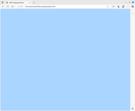
Preview the web page.
HELP: To Preview your web page type: file:///c:/htdocs/ in the URL box at the top and hit enter. If you've followed directions to this point you will see your web page mytemplate.html in the Folder Index that pops up. Just click on the web page file to open it in the browser..
You should see something like this:
The viewport Meta Tag
This is one of the most important meta tags you'll use for responsive design.
Leave it off or set it to no scale and when viewed on a cell phone your web page will be viewed at about an inch wide.
<meta name="viewport" content="width=device-width, initial-scale=1">
Help: My apologies. Learning to use a new editor, Geany. Recently she changed the viewport code to no scale and I didn't notice it until I viewed the page in my cell. How and why she did it, is beyond explanation. Sorry to those affected.
Adding Attributes to a Tag
When adding attributes to any html tag they are placed as shown:
<p attributes are placed here></p>
Examples:
<div class="outline"></div>
<p style="color: red"></p>
<meta name="description">
<link rel="stylesheet">
Focus at this point on learning to recognize the open and close tag for each element that is added to your web page. The closing tag always includes a forward slash.
</html></head></body>
Almost all HTML tags come in pairs. There are some exceptions.
You should be able to find 2 exceptions in the code placed so far.
In Lesson #3 we'll add a heading to the page.
If you think you're ready, Proceed to Lesson #3
 go back